Yesterday I published a piece about how Apple could address concerns about Safari’s new bottom bar centric design in iOS 15. Many folks are unhappy with the redesign, but some of us (me included) really like it. I spent some time figuring out different ways Apple could extend this new design language to other built-in apps on the iPhone. I narrowed it down to three distinct user interface components.
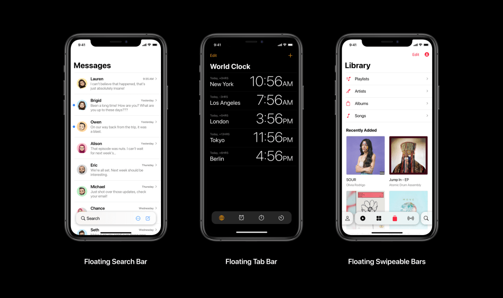
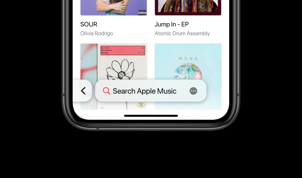
Safari’s new design is focused on improving one-handed use, and lots of other apps could also use improvements in that department. The first design is very clearly inspired by Safari and includes a bottom search bar. It could be applied to several stock apps, but I chose to show it in the context of the Messages app. In the case of Messages, the edit button that normally lives in the top left could be replaced by the three-dot more icon that sits in the floating search bar. The top-right new Message button would move down to the place the tab button currently sits in Safari.

I would call this style a “floating search bar” and it could easily replace search bars that are aligned to the top of apps that don’t already have a tab bar or tool bar at the bottom.
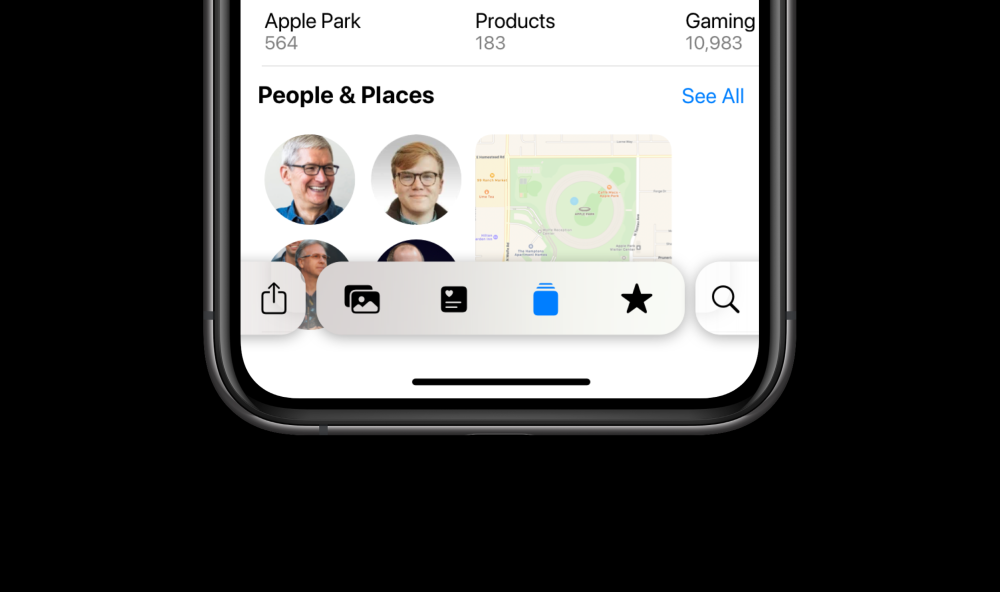
For apps that do have a bottom tab or tool bar, they could offer a “floating swipeable bar” that works like the new tab gesture in Safari. In the center, tabs could live and off to the right side could be search. With a quick tap or swipe you would enter search modes. Developers could also offer another feature on the left side. In the case of Photos it could be a shared feed. Or in the case of Music it could be your profile.
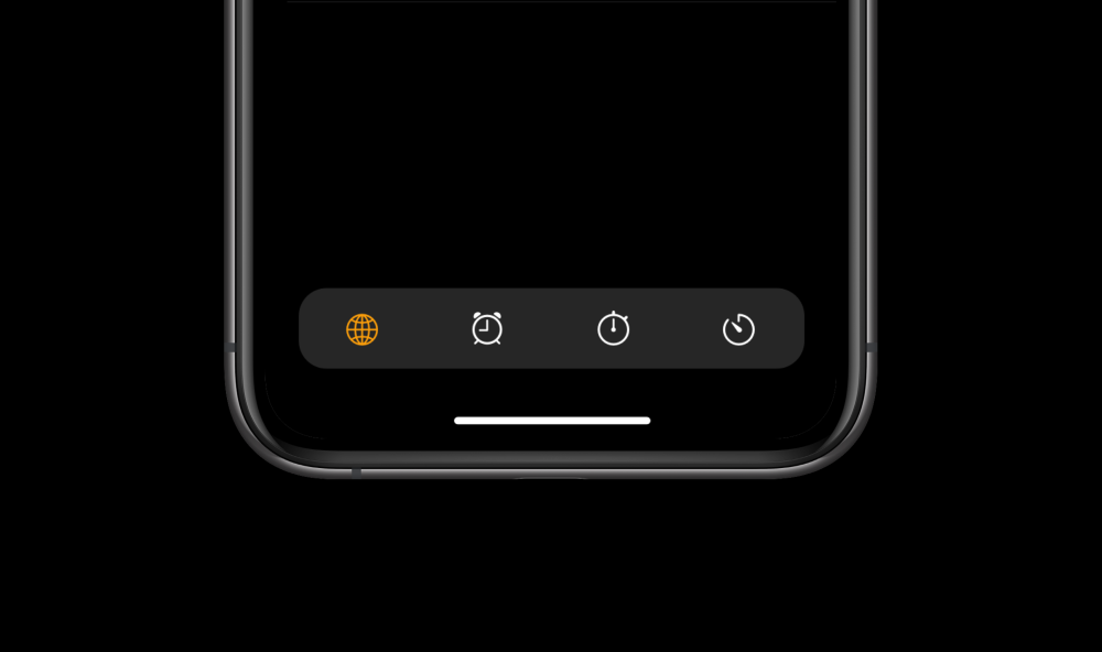
Not all apps will need a search field but still might want to use the more modern design. In this case you can see what Clock’s tab bar might look like. It’s more refined, doesn’t show labels, and floats above the content behind it.
Apple could offer a simple switch under accessibility settings that enables labels again in tab bars. After more than a decade, though, I think most users will be able to identify a feature by its familiar icon.

These three new designs could modernize all of Apple’s built-in apps as well as developers’ apps. It can also enable more items to be placed in the tab bar. With the “floating swipeable bar” there could be a total of six options rather than the current maximum of five.

What do you think about the new Safari design in iOS 15 on the iPhone? Would you like to see Apple apply the new design language to other apps? Would you like developers to redesign their apps this way? Let us know what you think in the comments below!
Check out 9to5Mac on YouTube for more Apple news:
"bring" - Google News
June 22, 2021 at 10:56PM
https://ift.tt/3j2KsLX
Concept: How Apple could bring Safari’s new design to other built-in apps on the iPhone - 9to5Mac
"bring" - Google News
https://ift.tt/38Bquje
Shoes Man Tutorial
Pos News Update
Meme Update
Korean Entertainment News
Japan News Update
Bagikan Berita Ini


0 Response to "Concept: How Apple could bring Safari’s new design to other built-in apps on the iPhone - 9to5Mac"
Post a Comment